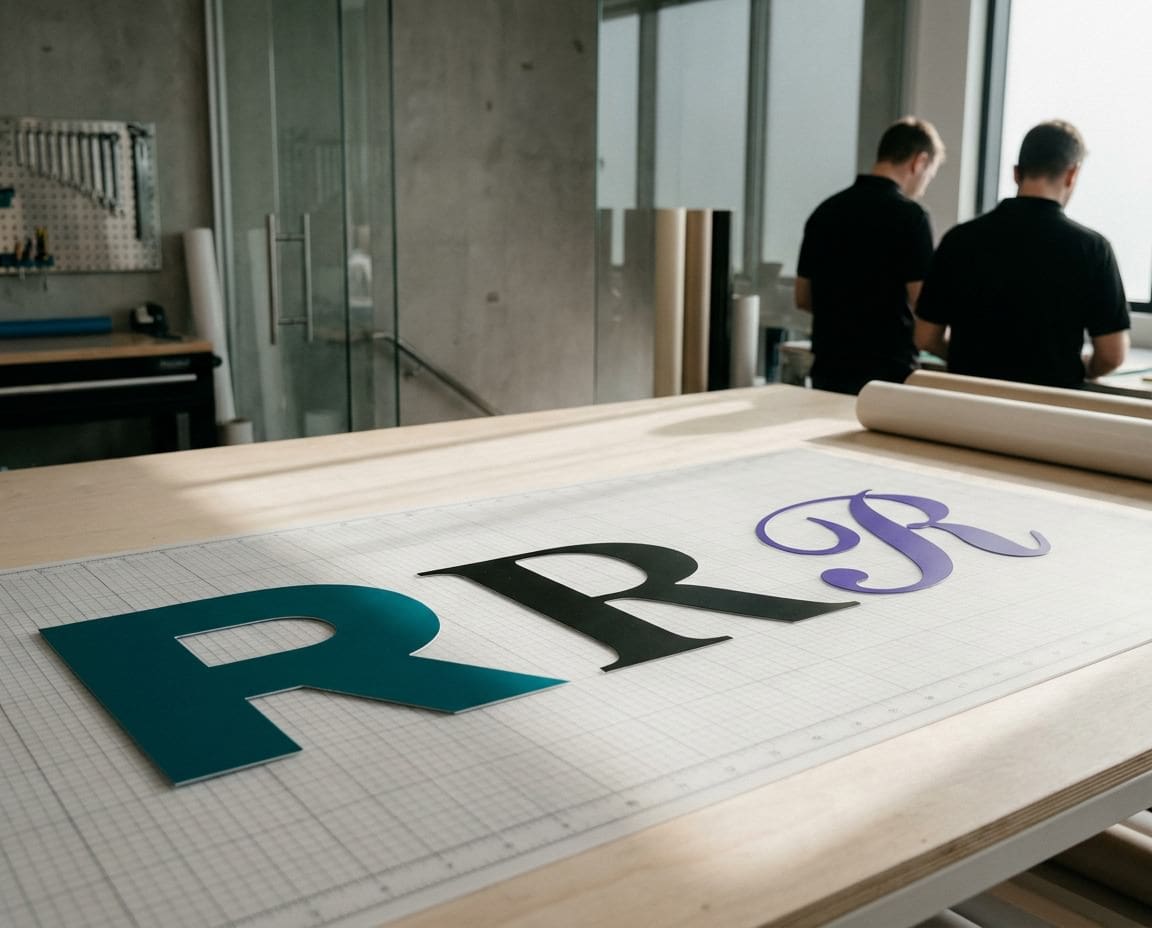
There are thousands of typefaces out there, and every one of them is a click away in a drop down menu. That is the problem. So which font for your sign? The honest answer is the one that reads clearly at a distance and feels right for your business. Everything else is detail.
This guide explains how we choose type for shop signs and exterior signs, and what to look for if you are picking a font yourself.
Start by looking at other signs
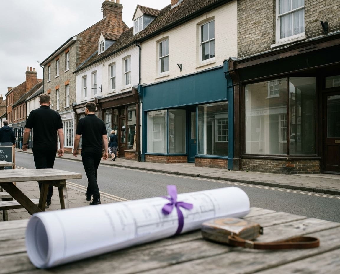
Phil’s first piece of advice costs nothing. Go for a walk down your high street and look at the signs properly. Notice how each one makes you feel. Some feel warm, friendly and homely. Others feel official, solid and professional. Very few feel neutral.
Most of that feeling comes from the typeface. Broadly, fonts fall into two camps: casual and friendly, or traditional and formal. A children’s nursery and a firm of solicitors sit at opposite ends, and their signs should look like it. Decide which camp your business belongs in before you scroll through a single menu.
Serif, sans serif and script
Almost every font you look at belongs to one of three families. Each has a place on a sign, and each has limits.
| Style | What it looks like | Feels | Best for |
|---|---|---|---|
| Serif | Small feet on the ends of strokes | Traditional, established, trustworthy | Heritage shops, professional services, pubs |
| Sans serif | Clean strokes with no feet | Modern, clear, approachable | Most shop signs, wayfinding, vans |
| Script | Joined or flowing, like handwriting | Personal, crafted, elegant | A short name or single word, never long text |
Sans serif: the safe workhorse
A good sans serif with open letter shapes is the most legible choice at distance, which is why it is used on road signs and wayfinding. If you are unsure, start here.
Serif: character with care
A serif face with sturdy serifs reads well and adds a sense of heritage. Avoid serif fonts with very fine hairlines, because the thin parts vanish from across the street.
Script: one word, used sparingly
Script fonts look lovely on a wedding invitation and fall apart on a fascia read by a passing driver. Use script for a single short word, like a name, and pair it with a clear sans serif for everything else.
Legibility at a distance
What looks crisp on a laptop screen at arm’s length is a very different thing on a building twenty metres away. A few features make the biggest difference.
- Open shapes: letters like a, e, c and s with generous openings stay distinct at distance. Tight, closed shapes blur together.
- Generous x height: the height of the lower case letters compared to the capitals. Taller lower case reads bigger for the same overall size.
- Distinct characters: a capital I, lower case l and the number 1 should look different from one another.
- Even spacing: letters that are too tight run into each other. Our article on kerning explains how spacing between pairs of letters is adjusted.
Fancy fonts, outlines, bevels, drop shadows and gradient fills are tempting, and they fail at a distance. Phil’s advice on this one is short: just don’t do it.
Weight and width
Every typeface comes in weights, from thin to black, and many come in widths, from condensed to extended. These choices matter as much as the font itself.
Too light, and the strokes disappear. Too heavy, and the gaps inside letters like e and a fill in, so the word becomes a dark blob. A regular to bold weight usually reads best on a sign. Condensed fonts let you fit more letters into a narrow fascia, but squeezing too hard makes words harder to read. It is usually better to cut a word than to squash the font.
How fonts behave when they are made
A font on a sign is not just printed ink. It is cut, routed, built or lit, and some typefaces suit that better than others.
Cut vinyl lettering
Vinyl letters are cut by machine and then weeded by hand, which means peeling away the waste around each letter. Very fine strokes, tiny serifs and sharp points are fiddly to weed and are the first parts to lift over time. Fonts with solid strokes and simple shapes cut cleanly and last.
Built up and illuminated letters
Built up letters are made as individual three dimensional pieces, so every letter needs enough body to have depth and strength. Thin strokes and delicate serifs are hard to fabricate and harder to light evenly from inside. If you want illuminated letters, a confident weight gives the light room to work.
Printed panels
Printing on our HP Latex printer reproduces almost any font faithfully, but the legibility rules still apply. Printing can reproduce detail that the eye still cannot read from across the road.
Phil’s top tips for choosing a sign font
- No more than two typefaces. Any more and the sign becomes a dog’s dinner.
- Make the main message pop. Use weight and size so one thing is read first.
- The business name does not always need to be the star. Sometimes the web address or what you do matters more.
- Swap the font and stand back. Try three or four options on screen, then look from the far side of the room.
- Ask two people for their opinion. Then remember it is your sign, and the final call is yours.
Match your brand
If your business already has a brand font, use it, or a close sign friendly cousin of it, so your sign, van and website feel like one business. Our guide on capitals or lower case covers how to set that font once you have chosen it.
A note on font licences
Fonts are licensed, and many free download sites offer fonts for personal use only. A business sign is commercial use, so check the licence covers it before your font ends up on a fascia.
Not sure which font to choose?
Send us your logo or your ideas and we will help you pick a typeface that suits your business and reads from the street. Have a look at our shop signs and exterior signs, or call us on 01296 399202.
Leave a Reply Cancel reply
Put your brand on everything.
Your brand doesn't stop at the screen. Sign Rite Grafix puts it on your vehicle, your windows, your walls, your pop-up, wherever it needs to be seen. If you can picture it, they can make it and fit it.
FROM THE DIGITAL WORLD TO THE REAL ONE



comment on this post