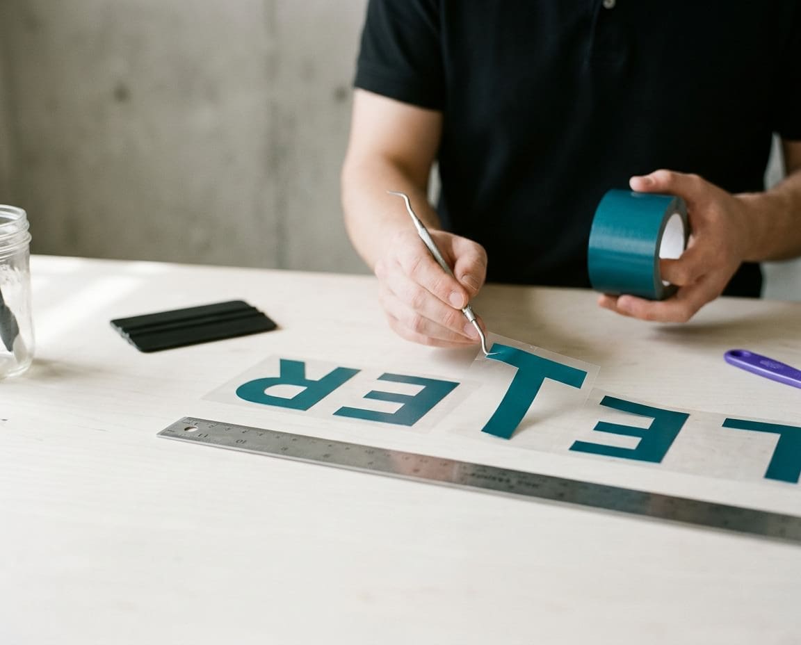
What is kerning? It is the adjustment of space between two particular letters so a word looks evenly spaced to the eye. It sounds like a tiny detail, and on a business card it often is. On a shop fascia with letters 400mm tall, it is the difference between a sign that reads cleanly from across the road and one that looks slightly off to everyone who passes.
This is an updated version of a guide Phil first wrote in 2023. Letter spacing is something we fuss over on every job, from exterior signs and shop fascias to interior signs and wayfinding, so here is how it works and how we get it right.
Kerning, tracking and leading: what is the difference?
These three terms get mixed up all the time, even by people who work with type every day. They all describe space, but each one controls a different kind.
- Kerning is the space between one specific pair of letters, such as the A and V in AVENUE. You adjust it pair by pair.
- Tracking is the overall spacing across a whole word, line or block of text. Tighten the tracking and every gap shrinks by the same amount.
- Leading is the vertical space between lines of text, measured from one baseline to the next. The name comes from the strips of lead that printers once placed between lines of metal type.
Kerning has its own roots in metal type too. A kern was the part of a letter that hung over the edge of its metal block, so it could tuck under or over its neighbour. Today we do the same job digitally, but the aim has not changed: even, comfortable spacing that the reader never notices.
The letter pairs that cause the most trouble
Every letter has its own shape, and some shapes leave awkward gaps when they sit side by side. Fonts are spaced so each letter has a set amount of room around it, which works well for most combinations and badly for a few.
Classic problem pairs
- AV and VA: the diagonals lean away from each other, leaving a wedge of empty space at the top or bottom.
- To, Tr and Ty: the crossbar of the T overhangs, so the next lowercase letter looks stranded unless it tucks underneath.
- Wa and We: the same issue as the T, with the wide arms of the W holding the next letter at a distance.
- LT: two letters with lots of open space on the facing sides, which can make one word look like two.
- Yo, Pa and F followed by a lowercase letter: more overhangs that open up visible holes.
When letters crash into each other
The opposite problem is spacing that is too tight. Squeeze an r and an n together and they read as an m, so ‘burn’ becomes ‘bum’. Designers have a running joke about this called ‘keming’, which is the word ‘kerning’ with the r and n pushed together until they look like an m. It is funny until it is on your van or above your shop door.
Other pairs to watch when spacing is tight include cl reading as d, and vv reading as w. On a sign seen from a distance, these mistakes get worse, not better.
Metric and optical kerning in design software
Most design programs give you two automatic kerning options, and it helps to know what each one does.
Metric kerning uses the kerning pairs built into the font by its designer. A well made font has hundreds or thousands of these pairs, and metric kerning is usually the right starting point. Cheaper or free fonts often have few pairs or none, which is where problems start.
Optical kerning ignores the built-in pairs and lets the software judge the spacing from the shapes of the letters. It is useful for fonts with poor kerning data, or when you mix two fonts in one line. Neither option is perfect, so for sign work we treat the automatic result as a first draft and then adjust the pairs by eye.
Why letter spacing matters more on signs
On a printed page, a small kerning flaw is a fraction of a millimetre. Scale that word up to a fascia and the same flaw becomes a visible gap of several centimetres. Signs magnify every spacing decision.
Viewing distance
People read signs from across a road, from a moving car or from the far end of a corridor. At distance, uneven gaps break a word into chunks and tight pairs blur together. Good spacing keeps the word shape intact, which is what people actually read at a glance.
Cut vinyl and built-up letters
Cut vinyl lettering is weeded and applied as individual characters, and built-up letters are made and fixed one at a time. The spacing on the drawing is the spacing on the wall, so if the artwork is wrong, the sign is wrong. Fitters work from a full-size template or marked positions, which means the kerning has to be settled before anything is made.
Illuminated letters
Lighting changes how letters look. Face-lit letters glow and appear slightly bolder, and halo-lit letters throw light onto the wall behind, so gaps can look different at night than in daylight. We think about both views when spacing an illuminated sign.
| Medium | Why spacing is critical |
|---|---|
| Printed panel | Large scale magnifies every gap |
| Cut vinyl lettering | Each letter is applied separately |
| Built-up letters | Each letter is fixed individually to the wall |
| Illuminated letters | Light spill changes how gaps look at night |
How sign makers check spacing
Kerning is a judgement of the eye, not a calculation. That is why the old advice about setting letters on a grid to get the spacing right misses the point. A grid helps with alignment and layout, but even spacing comes from looking at the shapes and the areas of white space between them.
These are the checks we use in our studio:
- Print it full size. A full-size print of the key words, taped to a wall and viewed at the distance people will read it, shows spacing problems a screen never will.
- Turn it upside down. Flip the artwork and you stop reading the words and start seeing the shapes. Uneven gaps jump out straight away.
- Step back. View the proof from the distance your customers will, and squint. Any word that breaks apart or clumps together needs work.
- Check the worst pairs first. Go straight to the AV, To and LT combinations, then the r and n pairs.
- Look at the whole line. After kerning individual pairs, check the tracking so the word sits well as a unit.
Choosing the right font and case
Some fonts are much easier to space than others. A clean, well made typeface with good kerning data saves time and gives a better result on a sign. Our article on which font to choose covers this in more detail.
Case matters too. Words set in capitals need more generous tracking than lowercase, because capitals are built to sit next to lowercase letters, not each other. We look at this question in to be or not to be: caps or lower case.
Planning a new sign?
Phil started out signwriting by hand, and spacing letters by eye has been part of our work since 1985. Getting the spacing right is part of designing every sign, so the lettering reads cleanly at full size. See our exterior signs or call our studio on 01296 399202 to talk about your project.
Leave a Reply Cancel reply
Put your brand on everything.
Your brand doesn't stop at the screen. Sign Rite Grafix puts it on your vehicle, your windows, your walls, your pop-up, wherever it needs to be seen. If you can picture it, they can make it and fit it.
FROM THE DIGITAL WORLD TO THE REAL ONE



comment on this post