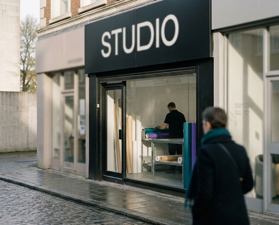
Signs are everywhere, and most of them are ignored. Walk down any high street and count how many you can remember five minutes later. Knowing how to design a shop sign people actually read is the difference between a fascia that brings customers through the door and an expensive board that blends into the brickwork.
Phil Aliphon, who founded Sign Rite Grafix in 1985, has a story he tells about this. A customer holds their hands apart and asks for a sign ‘this big’, with 15cm letters, and the words they want would never fit at that size. Most of our customers are not designers, and they should not have to be. That is our job, and this guide shares the principles we use on every shop sign and exterior sign we design.
Start with viewing distance and letter height
Before anyone picks a colour or a font, we ask one question: where will people be standing when they read this? A sign read by shoppers across a narrow pedestrian street is a very different job from a sign read by drivers on a ring road.
The further away your reader, the taller your letters need to be. Sign makers use rules of thumb to set a starting size, but the honest test is physical. Print the main word at full size, tape it to the wall and walk back to where your customers will actually be. If you squint, the letters are too small or too thin.
Remember that your sign has a fixed width. Every extra word you add shrinks every letter, so letter height and wording are always a trade. That is why the next principle matters so much.
One main message, then everything else
A good shop sign has a clear hierarchy. One thing is read first, a second thing is read if the viewer has time, and everything else is for people standing right in front of it. When everything is the same size, nothing gets read.
Decide what your one main message is. For most shops it is either the business name or what the business does. For a new business nobody has heard of yet, the trade is often more useful than the name. Our article on what your sign should say goes into wording in detail.
- First read: the name or the offer, large and bold.
- Second read: a short line explaining what you do, if the name does not.
- Third read: phone number or web address, smaller, for people already close.
Contrast and colour: be seen before you are read
People notice a sign before they read it, and contrast is what gets it noticed. Dark letters on a light background, or light letters on a dark background, read far better than two mid tones side by side. Red on green, blue on black and yellow on white all look fine on a screen and disappear on a building.
Think about what surrounds the sign as well. A white fascia on a white rendered building has nothing to stand out against. A dark fascia on pale brick, or a bright panel on a dark shopfront, gives the eye an edge to find.
| Combination | How it reads at distance |
|---|---|
| Black on yellow | Very strong, used widely for safety for good reason |
| White on dark blue, green or black | Strong and smart, suits most shopfronts |
| Black on white | Clear and classic |
| Red on green | Weak, and hard for colour blind viewers |
| Yellow on white | Very weak, close to invisible in daylight |
White space is not wasted space
The most common mistake we see is a sign crammed edge to edge. Owners feel that empty board is money spent on nothing. In fact the clear space around your lettering is what lets the eye find it.
Leave a generous margin around the main message and between each line. If the design feels tight on screen, it will feel tighter on the building, because the fascia frame, the brackets and the shop window all crowd in around it.
Choose typefaces that stay legible
Fancy scripts, outlines, drop shadows and very thin strokes look lovely at arm’s length and turn to mush at twenty paces. Simple, solid letterforms with open shapes read best. Use one typeface for the main message, a second at most for supporting lines, and keep spacing between letters even.
We cover this properly in our guide to choosing a font for your sign, including serif, sans serif and script styles and how each behaves when it is cut in vinyl or made as built-up letters.
Placement and height on the building
A beautifully designed sign in the wrong place will still be missed. Look at how people approach your premises: on foot from either side, from a car park, or from the road.
Things to check on site
- Sight lines: trees, lamp posts, bus shelters and neighbouring signs that block the view.
- Angle of approach: a flat fascia is invisible to someone walking along the same pavement, which is why a projecting sign often earns its place.
- Height: too high and pedestrians walk underneath it without looking up, too low and it is hidden behind parked vans.
- Alignment: a sign that sits square with the windows and doors looks deliberate, one that does not looks like an afterthought.
If your shop is on a listed building, the sign will normally need listed building consent, and many illuminated signs need advertisement consent from the local council. Check this with your local planning authority before you commit to a design.
Lighting: half your trading day happens in the dark
In a British winter it is dark by late afternoon, which is when many people are driving or walking home past your shop. A sign that cannot be seen after dark is only working part time.
Options range from trough lights and spotlights washing a flat fascia to built-up letters lit from within or halo lit from behind. The design principles stay the same: lighting should make the main message brighter and clearer, not compete with it. Test the colours you choose under light, because some shades change character once they are lit.
Test your design by standing back
Phil’s favourite test costs nothing. Put the design on screen, stand at the far side of the room and look at it for three or four seconds. Then turn away and say what you saw. If you cannot remember the main message, neither will a passing customer.
A better version still is a mock up on a photo of your actual building, taken square on from across the street. Seeing the scale, colours and spacing in place before anything is made saves a lot of second guessing later.
- Can you read the main message from where customers will be?
- Is it obvious what the business does?
- Does it still stand out in a photo of the whole street?
- Would it read in the dark?
Planning a new shop sign?
If you have read this far, you already know more than most about how to design a shop sign that works. Have a look at our shop signs and exterior signs, and when you are ready, call us on 01296 399202 and we will help you turn the principles into a sign people actually read.
Leave a Reply Cancel reply
Put your brand on everything.
Your brand doesn't stop at the screen. Sign Rite Grafix puts it on your vehicle, your windows, your walls, your pop-up, wherever it needs to be seen. If you can picture it, they can make it and fit it.
FROM THE DIGITAL WORLD TO THE REAL ONE



comment on this post