Colours, fonts and materials get most of the attention, but sign wording is the most important design element on any sign. Get it wrong and no amount of lighting or gold leaf will save it. So before anything else, ask the simple question: what should your sign say?
This guide covers how to write sign wording for shop signs and exterior signs and for vans and vehicle graphics, with real before and after rewrites you can borrow.
Phil’s rule: seven words or fewer
Phil Aliphon, who founded Sign Rite Grafix in 1985, works on a simple rule of thumb. A passing motorist gets under four seconds to read a sign, so aim for seven words or fewer, and make sure every one of them is spelt correctly and punctuated properly.
He has a story that proves the point. On his way to work there is a garage with a flag outside that says TIRES. It irritates him every time, because in the UK the word is TYRES. But here is the thing: it is the only sign on that whole journey he can remember. It is one word, it is big, and it tells you exactly what the business does.
We would still spell it correctly. But the lesson stands. Less is more, and people need to know what business you are in at a glance.
Lead with what you do
The most common wording mistake we see is a sign that tells you the owner’s name and nothing else. If people already know you, that works. If they do not, a name on its own leaves them guessing.
The name versus the offer
Ask yourself if your business name explains itself. ‘Mill Lane Bakery’ does. ‘Ellis and Co’ does not. If your name is not self explanatory, the sign needs a second line that is, and sometimes the offer deserves to be bigger than the name.
| Your name | Does it explain itself? | What to add |
|---|---|---|
| Smith’s Plumbing | Yes | Nothing, or a phone number |
| The Green Room | No | Hair and Beauty |
| Hollins Ltd | No | Office Furniture Showroom |
| Fresh Bites | Partly | Café and Takeaway |
That second line is what turns a passer by into a customer. It answers the only question they have: is this for me?
Phone, web address or QR code?
Contact details are the third read on most signs, smaller and for people already close. Choose based on how your customers actually get in touch with you, and resist the urge to list everything.
- Phone number: best for trades and services where people call to book. Easy to remember if it is local and written in clear groups.
- Web address: best when people need to see your work, menu or prices before they get in touch. Keep it short and drop the www and https.
- QR code: useful on a window, A-board or counter where people are standing still with a phone in hand. Useless on a fascia read from across the road or on a moving van.
- Social handles: fine as a small extra on a window, rarely worth the space on the main sign.
One clear contact route beats three tiny ones. If you want both a number and a web address, make one the lead and the other secondary.
Writing for vans and moving viewers
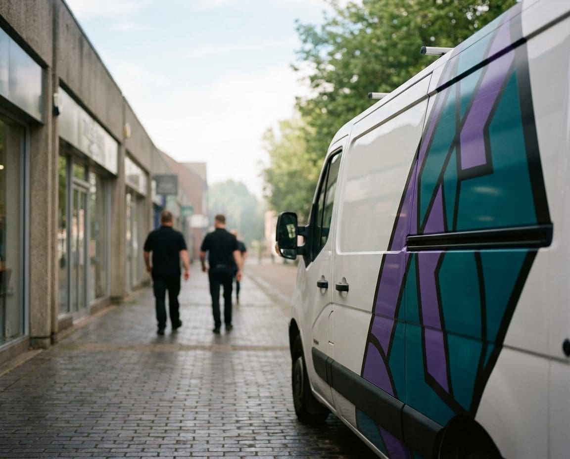
A van is a sign that moves, and so does the person reading it. They are in traffic, at a junction or behind you on a dual carriageway. That makes Phil’s seven word rule even more important on vehicles.
The rear doors get the longest look, because the driver behind is sitting there at the lights. Put your trade and phone number on the back. The sides are read in a passing glance, so the name and the service are all that will register.
A van checklist
- What you do, in two or three words
- Your name, if it is not already obvious
- One contact route, big enough to read from a car length away
- Nothing on the panels that will be split by handles or door shuts
Before and after: rewriting wordy signs
These are generic examples of the kind of wording we are sent, and how we would tighten it. Count the words.
A shopfront fascia
Before: ‘Welcome to J. Patel and Sons, Family Run Business Established Over 20 Years, Quality Fruit and Vegetables, Groceries, Household Goods and Much More, Open 7 Days’. That is 26 words, and nobody will read it.
After: ‘Patel’s Greengrocer’ as the main line, with ‘Fresh fruit and veg daily’ underneath. Seven words in total, and the business is obvious from across the street.
A builder’s van
Before: ‘All Aspects of Building Work Undertaken, Extensions, Loft Conversions, Kitchens, Bathrooms, Patios, Driveways, Fully Insured, Free Quotes, No Job Too Small’.
After: ‘Extensions and Lofts’ in large letters, the company name, and a phone number on the back doors. Lead with the work you most want more of. The full list belongs on your website.
An office building
Before: ‘Head Office and Registered Address of Hollins Business Solutions Limited, Visitors Please Report to Reception’.
After: ‘Hollins’ on the building, and a separate small sign at the door that says ‘Reception’. Two signs, each with one job, work better than one sign trying to do both.
Check every word before it is made
Spelling and grammar mistakes on a sign are permanent, public and expensive to fix. Before you approve wording, read it backwards one word at a time, check apostrophes, and ask someone who has not seen it before to read it aloud.
- Is it seven words or fewer for the main message?
- Does it say what you do?
- Is every word spelt correctly in UK English?
- Is there one clear way to contact you?
Our guide to the four questions to answer before you order a sign will help you decide what the sign needs to achieve, which makes choosing the words much easier.
Need help with your sign wording?
Send us your draft wording and we will help you cut it down to something people actually read. See our shop signs and exterior signs and van signwriting, or call 01296 399202.
Leave a Reply Cancel reply
Put your brand on everything.
Your brand doesn't stop at the screen. Sign Rite Grafix puts it on your vehicle, your windows, your walls, your pop-up, wherever it needs to be seen. If you can picture it, they can make it and fit it.
FROM THE DIGITAL WORLD TO THE REAL ONE



comment on this post