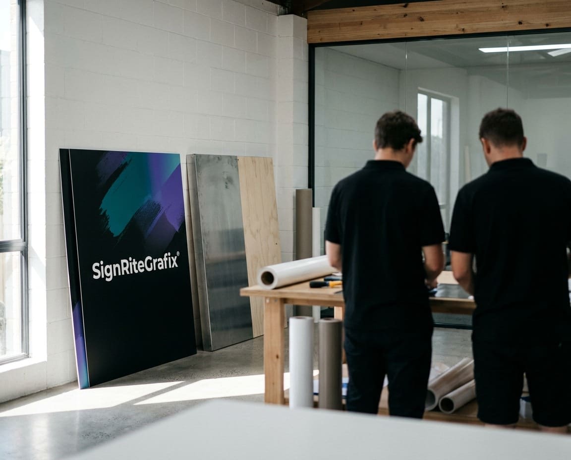
A logo refresh is not the same as a rebrand. A refresh keeps everything people already recognise about your business and brings the rest up to date. Done well, your customers notice that you look sharper, without ever wondering whether you are the same company.
We know this first hand, because we refreshed our own logo for our 35th anniversary. Here is how we did it, and how to do the same for your business, from the sketch stage right through to your shop signs and exterior signs.
Our own logo refresh
Sign Rite Grafix was founded in 1985, so 2020 marked our 35th year. When we announced our new logo in 2019, we had been using pretty much the same one for 28 years. In that time we had watched design trends come and go: bevels, outlines, drop shadows and fades all had their moment.
We wanted to stay current, but we did not want to throw our logo away. Years of signs, vans and paperwork had built up recognition we were not willing to lose.
So we kept our core colour palette for continuity and worked on everything else. We spent months on variations before settling on the final design, then rolled it out gradually across every platform, finishing in 2020.
Signs your logo needs a refresh
Not every old logo needs changing. Some of the best known marks in the world have barely moved in decades. But these are good signs that yours is due some attention:
- It relies on effects that date it, such as bevels, gradients, glows or drop shadows.
- It does not work in one colour, so it struggles on a van door, a window or a stamp.
- It falls apart when small, on a social media profile or a website tab.
- It loses detail when cut in vinyl or made as built-up letters.
- Different versions have crept in over the years, and nobody is sure which is the original.
- Your business has grown or changed, and the logo no longer reflects what you do.
What to keep
The point of a refresh is continuity. Before changing anything, list what people actually recognise you by. That is usually less than you expect, and it is the part you protect.
Your colours
Colour is often the first thing people remember. A customer who sees a van in your colours from the other side of the road knows it is yours before they can read the name. Keeping your core colours, as we did, is the simplest way to stay recognisable.
Recognisable shapes
If your logo has a distinctive symbol, a particular letter shape or a familiar layout, keep the idea and refine the drawing. Tidy up the curves, simplify the detail and balance the proportions, but leave the shape your customers know.
Your name
Unless the business itself has changed, keep the name and the way it is written. Changing spelling or word order is a rebrand, not a refresh, and it needs a much bigger plan. Our article on what branding is explains why these elements carry so much weight.
What to update
With the core protected, this is where the refresh happens:
- Remove dated effects. Flat colour reads better on signs, screens and vehicles.
- Refine the typeface. A cleaner, better spaced font improves legibility at every size.
- Simplify detail. Fine lines and tiny elements disappear at small sizes and are hard to cut in vinyl.
- Create versions. A full logo, a stacked version, a simple icon, and one-colour and reversed versions for dark backgrounds.
- Tighten the colours. Set exact colour references for print, vinyl and screen, so your colours match everywhere.
Rolling out a refreshed logo in stages
Changing everything overnight is expensive and rarely necessary. A staged rollout spreads the cost, and because the logo has only evolved, old and new can sit side by side for a while without confusing anyone.
A sensible order looks like this:
- Stage one: digital. Website, social media profiles, email signatures and online listings. Quick to change and seen by the most people.
- Stage two: stationery and print. Order new letterheads, cards and leaflets as old stock runs out.
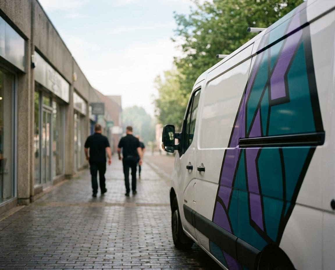
- Stage three: vehicles. Update van signwriting and fleet graphics as each vehicle is due, or plan the whole fleet in one go for consistency.
- Stage four: signs and premises. Shop signs, fascias, window graphics and interior signs, often timed with a refit or lease renewal.
- Stage five: everything else. Uniforms, packaging, promotional items and exhibition materials as they are replaced.
Checklist: everywhere your logo appears
Before you start, list every place your logo lives. Most businesses are surprised by the length of this list.
| Area | Where to look |
|---|---|
| Premises | Fascia, projecting sign, window graphics, door vinyls, reception sign, interior signs |
| Vehicles | Van signwriting, car graphics, magnetic signs, trailer graphics |
| Business cards, letterheads, compliment slips, leaflets, brochures | |
| Display | Banners, roller banners, A-boards, exhibition stands, site boards |
| Digital | Website, favicon, social profiles, email signature, online directories |
| Paperwork | Invoices, quotes, contracts, presentation templates |
| Clothing and packaging | Uniforms, workwear, bags, labels, stickers |
Work through the list, decide what changes at each stage, and keep a record of what has been updated. That way nothing gets missed, and the old logo does not linger on a forgotten board in the car park.
Brand guidelines keep it consistent
A refreshed logo needs a short set of rules, so everyone uses it the same way. It does not have to be a thick manual. A few pages covering the logo versions, clear space, minimum sizes, colour references and fonts will stop the inconsistencies that made the refresh necessary in the first place.
Share the guidelines with everyone who produces anything with your logo on it: your web designer, your printer, your sign maker and anyone ordering workwear. Send them the correct files too, in vector format for signs and vehicles and in high resolution for print. Most logo drift happens when someone copies a low quality image from an old website or an email footer because it was the easiest file to find.
Planning a logo refresh?
When your refreshed logo is ready, we can roll it out across your signs, windows, vans and premises, in stages or all at once. See our exterior signs and van signwriting pages, or call our studio on 01296 399202.
Leave a Reply Cancel reply
Put your brand on everything.
Your brand doesn't stop at the screen. Sign Rite Grafix puts it on your vehicle, your windows, your walls, your pop-up, wherever it needs to be seen. If you can picture it, they can make it and fit it.
FROM THE DIGITAL WORLD TO THE REAL ONE



comment on this post